Evolution skin

Over the past year, we've been working hard to create a new look for DirectAdmin. We've called this new skin Evolution. This new skin has a similar feel to our directadmin.com website.

The changes brought forward with this new skin are far more than just the skin itself, but also how it communicates with DirectAdmin. We've added almost 100% JSON support in DirectAdmin, allowing for in-page editing. This should also open up many options for plugin/script designers as they no longer need to rely only on the CMD_API calls. The GUI CMD_ calls can be used by simply adding json=yes to the request.

I want to use the Evolution skin

Evolution is the default skin in new installations of DirectAdmin. If you have another skin set to be the default one, and would like to change the default to Evolution, including the login page, login as admin, switch to reseller level, go to > Reseller Tools > Skin manager, select the 'evolution' skin and click 'Set Global'.

To change a skin just for you (admin), click the 'Apply to me'. To change a skin for your users (under admin reseller), click on 'Apply to All users'.

Change everyone on the server to Evolution

The following commands will change every admin/reseller/user and all the packages to use the evolution skin instead of enhanced:

cd /usr/local/directadmin/data/users
perl -pi -e 's|skin\=enhanced|skin=evolution|g' ../admin/packages/*.pkg
perl -pi -e 's|skin\=enhanced|skin=evolution|g' */packages/*.pkg
perl -pi -e 's|skin\=enhanced|skin=evolution|g' */user.conf
perl -pi -e 's|docsroot\=./data/skins/enhanced|docsroot=./data/skins/evolution|g' */user.conf

Evolution skin customizations

Evolution skin has an extensive customization support. This allows administrators and resellers to change how Evolution looks for themselves and their users.

All supported customizations can be managed in the Admin Tools / Customize Evolution Skin section.

Evolution customizations follows a limited inheritance structure:

All changes made by reseller accounts are visible for:

  • the reseller account itself
  • all user accounts that belongs to this reseller account

All changes made by admin accounts are visible for:

  • the admin account itself
  • all user accounts that belong to this admin account
  • all reseller accounts that belong to this admin account, unless they have their own customizations (local reseller customizations takes precedence)
  • all user accounts that belongs to resellers that belongs to this admin account, unless resellers have their own customizations (local reseller customizations takes precedence).

Customizing main colors

This section allows to change key colors used throughout the Evolution skin. Colors are grouped into two categories Component Colors and Theme Colors.

Component colors are colors used in the inner pages for text, links, tables, and small UI elements.

Theme Colors are used by evolution layouts for menus headers and other big layout related elements.

Each Evolution page can have a help link that allows users to read more about how to use a particular feature. By default help links points to a generic documentation page evo.site-helper.comopen in new window.

This section allows shared hosting providers to provide their own help pages.

Help links customization page

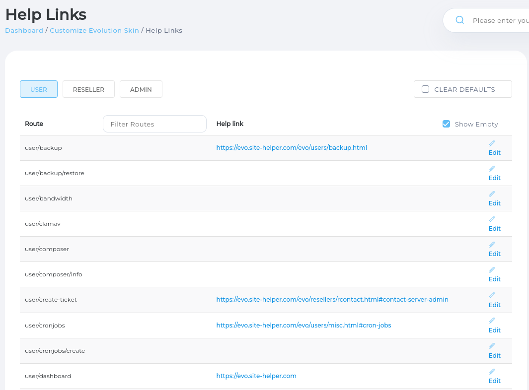
If CLEAR DEFAULTS check-box is checked none of the built-in links will be used. This makes it easier to ensure default help site is never used.

If CLEAR DEFAULTS check-box is not checked built-in help links are used for the pages where links were not customized.

Evolution pages are grouped into three big categories USER, RESELLER, ADMIN. Clicking on these buttons filters-out pages used only on this particular access level.

Customizing logos

Customizing user level

If you are using your own technical support system, you might want to provide a URL to it. This can be done by in Support & Help -> Manage Tickets -> Ticket System Settings, just untick 'Ticket System Enabled' and it will let you input the URL there.

If you have any other external systems you wish to add to the menu, you may do this using the Customize Evolution Skin > Menu: User > Support & Help > [Click on section title] > Add Entry on the right. Just change the radio button from 'Route' to 'Link', then provide a link to your external system, name it, and add an icon.

CSS Customizations

In this section you can add extra CSS rules that will be included in Enhanced skin. There is a section for styles that will be included always, and separate sections for individual layouts.

When writing custom CSS to make it more portable it is possible to use pre-defined variables for colors and images. Writing portable styles will allow you to utilize color and image customizations supported by Evolution without having to update your styles.

Here is a list of pre-defined CSS variables that could be used in custom styles:

VariableComment
--img-logoURL of logo image (light or dark depending on active mode)
--img-logo-lightURL of light mode logo image
--img-logo-darkURL of dark mode logo image
--img-symbolURL of symbol image (light or dark depending on active mode)
--img-symbol-lightURL of light mode symbol image
--img-symbol-darkURL of dark mode symbol image
--classicTheme color for classic layouts
--refreshedTheme color for refreshed layout
--primaryPrimary component color
--safeSafe component color (for confirmations)
--dangerDanger component color (for warnings)
--neutralNeutral component color

There is also scopes system that allows styles to be applied conditionally. Scopes are special classes that will be applied on the root html element if some conditions are met. Adding scopes to styles allows to controlling when particular style will be used.

Here is the list of predefined scope values:

Style selector for scopeStyle will be used when
html.mode\:lightEvolution is in light mode
html.mode\:darkEvolution is in dark mode
html.dir\:ltrSelected language uses left to right writing direction
html.dir\:rtlSelected language uses right to left writing direction
html.media\:small-phoneDevice screen width is 480px or lower
html.media\:phoneDevice screen width is between 480px and 768px
html.media\:tabletDevice screen width is between 768px and 1024px
html.media\:desktopDevice screen width is 1024px or higher
html.device\:mobileUsed on mobile phone
html.device\:desktopUsed on desktop browser

Starting DA 1.642 Evolution no longer supports sub-themes, if you have used traditional sub-theme it is possible to create same look and feel by adding this custom CSS block for Grid layout:

/* Styles to for 'traditional' sub-theme in grid layout */

/**
 * Update layout header colors
 * 1. Use "classic" Brand color as header background
 * 2. Use white color as default color for text / icons
 * 3. Use dark mode image as logo image (to have contrast with branded classic background)
 * 4. Use lightened classic color as background for new messages badge
 * 5. Use darkened classic color as text color for new messages badge
 * 6. Slightly dim white icons on hover to indicate hovered state
 * 7. Use lighened classic color as border color for inputs in header
 */

html[data-layout='grid'] .app  .app-header {
  --brand-color: rgb(var(--ui-classic-500) / 1); /* 1 */
  --on-brand-color: white; /* 2 */
  --border-color: rgb(var(--ui-classic-400) / 1); /* 7 */
}
/* header bar */
html[data-layout='grid'] .app .app-header {
	background: var(--brand-color); /* 1 */
	color: var(--on-brand-color); /* 2 */
}

/* header bar logo */
html[data-layout='grid'] .app .app-header .header-logo {
	background-image: var(--img-logo-dark); /* 3 */
}

/* user profile dropdown button */
html[data-layout='grid'] .app .app-header .userbar>.userbar-button>.userbar-button-text {
	color: var(--on-brand-color); /* 2 */
}

/* unread messages badge in user profile button*/
html[data-layout='grid'] .app .app-header .userbar>.userbar-button>.ui-icon-counter .roundBadge {
	background-color: rgb(var(--ui-classic-50) / 1) !important; /* 4 */
	color: rgb(var(--ui-classic-700) / 1); /* 5 */
}

/* caret in user profile button */
html[data-layout='grid'] .app .app-header .userbar .userbar-button-caret>svg>path,
/* bell icon in task list */
html[data-layout='grid'] .app .app-header .app-task-list .bell-icon>svg>path,
/* grid trigger button in header bar */
html[data-layout='grid'] .app .app-header .nav-grid-trigger svg>path {
	fill: var(--on-brand-color) !important; /* 2 */
}
/* hover state for bell icon */
html[data-layout='grid'] .app .app-header .app-task-list:hover .bell-icon>svg>path,
/* hover state for grid trigger button */
html[data-layout='grid'] .app .app-header .nav-grid-trigger:hover svg>path {
  opacity: 0.8 !important; /* 6 */
}

/* domain dropdown button */
html[data-layout='grid'] .app .app-header .domainsDropdown .Select>.Select__Button {
	border-color: var(--border-color); /* 7 */
	background: transparent; /* 1 */
}

/* domain dropbown button text */
html[data-layout='grid'] .app .app-header .domainsDropdown .Select>.Select__Button>.Select__Button__Label,
/* caret icon in dropdown button */
html[data-layout='grid'] .app .app-header .domainsDropdown .Select>.Select__Button>.icon>svg {
	color: var(--on-brand-color); /* 2 */
}

/* filter input in domains dropdown */
html[data-layout='grid'] .app .app-header .domainsDropdown .Select>.Select__Button>.Select__Button__Search {
	background: transparent; /* 1 */
	color: var(--on-brand-color); /* 2 */
}

/* Placeholder for filter input in domains dropdown */
html[data-layout='grid'] .app .app-header .domainsDropdown .Select>.Select__Button>.Select__Button__Search::placeholder {
	color: var(--on-brand-color); /* 2 */
}

/* search input */
html[data-layout='grid'] .app .app-header .search input[type="text"] {
	background: transparent; /* 1 */
	color: var(--on-brand-color); /* 2 */
	border-color: var(--border-color); /* 7 */
}

/* placeholder for search input */
html[data-layout='grid'] .app .app-header .search input[type="text"]::placeholder {
	color: var(--on-brand-color); /* 2 */
	opacity: 0.8; /* slightly dim it out to be less prominent */
}

/* search input icons left (magnifier glass) and right (gear) */
html[data-layout='grid'] .app .app-header .search .search-icon>.icon>svg,
html[data-layout='grid'] .app .app-header .search .options-icon>.icon>svg {
	color: var(--on-brand-color); /* 2 */
}

/* access level switch */
html[data-layout='grid'] .app .app-header .ui-toggle-switch {
	background: transparent; /* 1 */
	color: var(--on-brand-color); /* 2 */
	border-color: var(--border-color); /* 7 */
}

/* Access level switch label */
html[data-layout='grid'] .app .app-header .ui-toggle-switch>.label {
	background: transparent; /* 1 */
	color: var(--on-brand-color); /* 2 */
}

/* Access Level Switch active level indicator */
html[data-layout='grid'] .app .app-header .ui-toggle-switch>.options>.slider {
	background: var(--border-color) !important; /* 7 */
}


/**
 * Update Icons Grid Menu styling
 * 1. Expand menu filter input to take whole container width
 * 2. Apply border to menu categories to visually separate them
 * 3. Apply brand color to category header as background; apply white color on top of brand color
 * 4. Remove border from menu entries
 */
html[data-layout='grid'] .app .icons-grid {
  --brand-color: rgb(var(--ui-classic-500) / 1);
  --border-color: #e5e5e5;
  --on-brand-color: white;
  --border-radius: 4px;
}

/* menu filter input */
html[data-layout='grid'] .app .icons-grid .filters-bar>.filters-bar-search {
	flex-grow: 1; /* 1 */
	margin-right: 1rem;
}

/* menu entries category block */
html[data-layout='grid'] .app .icons-grid .icons-grid-category {
	border: 1px solid var(--border-color); /* 2 */
	border-radius: var(--border-radius); /* 2 */
}

/* menu entries category block header */
html[data-layout='grid'] .app .icons-grid .icons-grid-category .icons-grid-category-title {
	padding: 1rem;
	background-color: var(--classic); /* 3 */
	border-top-left-radius: var(--border-radius); /* 2 */
	border-top-right-radius: var(--border-radius); /* 2 */
	color: var(--on-brand-color); /* 3 */
}

/* menu entry */
html[data-layout='grid'] .app .icons-grid .icons-grid-category .icons-grid-category-entries .icons-grid-category-entry {
	border-width: 0; /* 4 */
}

/**
 * Update Dashboard (right sidebar)
 *
 * 1. Add a spacing around widgets and inside current widget
 * 2. Apply "brand" color background to current widget header
 * 3. Decrease caret icon size
 */

html[data-layout='grid'] .app .dashboard-mobile {
  --brand-color: rgb(var(--ui-classic-500) / 1);
  --on-brand-color: #fff;
  --space: 1rem;
  --border-color: #e5e5e5;
  --border-radius: 4px;
  --caret-size: 16px;
}

/* widgets accordion wrapper */
html[data-layout='grid'] .app .dashboard-mobile > div {
	padding: 1rem; /* 1 */
}

/* widget heading */
html[data-layout='grid'] .app .dashboard-mobile > div section.dashboardTab.dashboardTab {
	padding: 0 !important; /* remove padding so branding background would be full-width */
}

/* widget heading text */
html[data-layout='grid'] .app .dashboard-mobile > div section.dashboardTab.dashboardTab .dashboardTabHeader {
	padding: var(--space); /* 1 */
	font-size: 1.3rem;
	font-weight: 600;
	letter-spacing: 0.5px;
}

/* widget heading caret icon */
html[data-layout='grid'] .app .dashboard-mobile>div section.dashboardTab.dashboardTab .dashboardTabHeader .icon svg {
	width: var(--caret-size); /* 3 */
}

/* currently expanded widget heading */
html[data-layout='grid'] .app .dashboard-mobile>div section.dashboardTab.dashboardTab.-is-active {
	border: 1px solid var(--border-color); /* 4 */
	border-radius: var(--border-radius);
}

/* currently expanded widget heading text */
html[data-layout='grid'] .app .dashboard-mobile>div section.dashboardTab.dashboardTab.-is-active .dashboardTabHeader {
	background: var(--brand-color); /* 2 */
	color: var(--on-brand-color); /* 2 */
}

/* Description of currently selected widget */
html[data-layout='grid'] .app .dashboard-mobile>div section.dashboardTab.dashboardTab p:nth-child(2) {
	padding: 0 var(--space); /* 1 */
}

/* "View More" link */
html[data-layout='grid'] .app .dashboard-mobile>div section.dashboardTab.dashboardTab .dashboardTab-more {
	margin-left: var(--space); /* 1 */
}

/* Expanded widget content */
html[data-layout='grid'] .app .dashboard-mobile>div section.dashboardTab.dashboardTab .widget-content {
	padding: var(--space); /* 1 */
}

This section allows adding or removing or reordering menu elements.

How to translate the evolution skin

Evolution skin has an independent sets of translations. It is managed in a separate translation management system at translate.directadmin.comopen in new window.

Languages covering > 80% of all translation strings will be bundled with new DirectAdmin releases.

IF you have a full new language translation file we can help you import it into the translations system. Please contact us in the formopen in new window or open a support ticketopen in new window.

Last Updated: